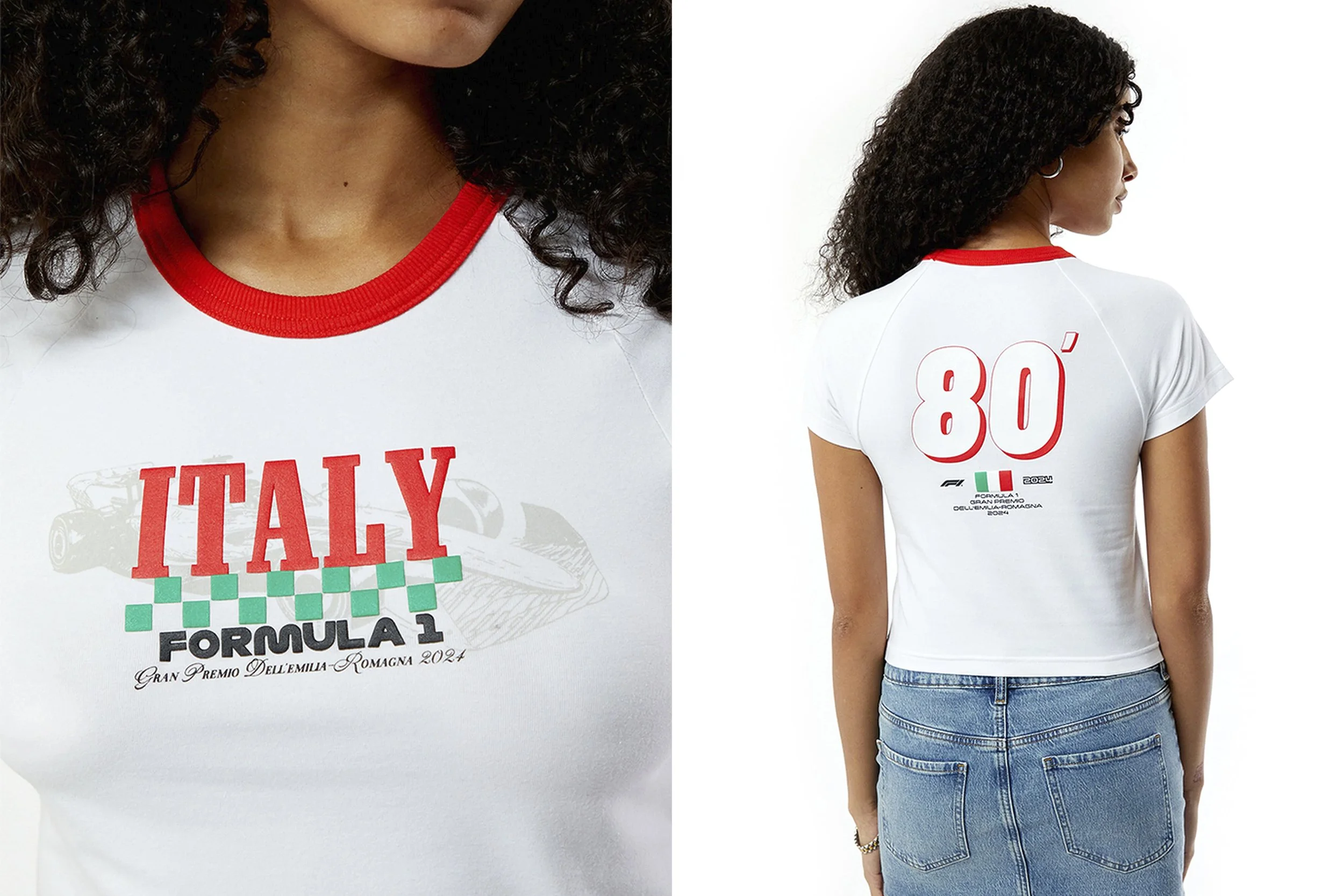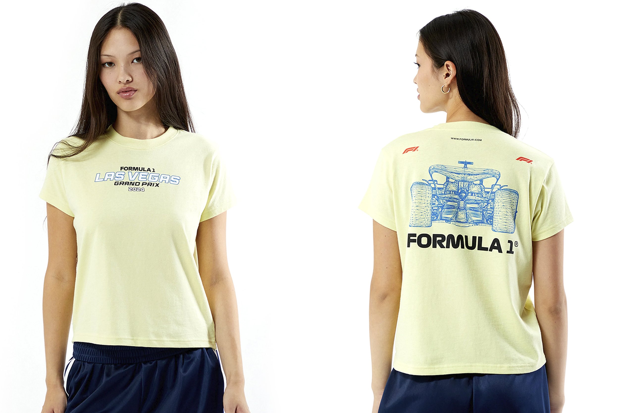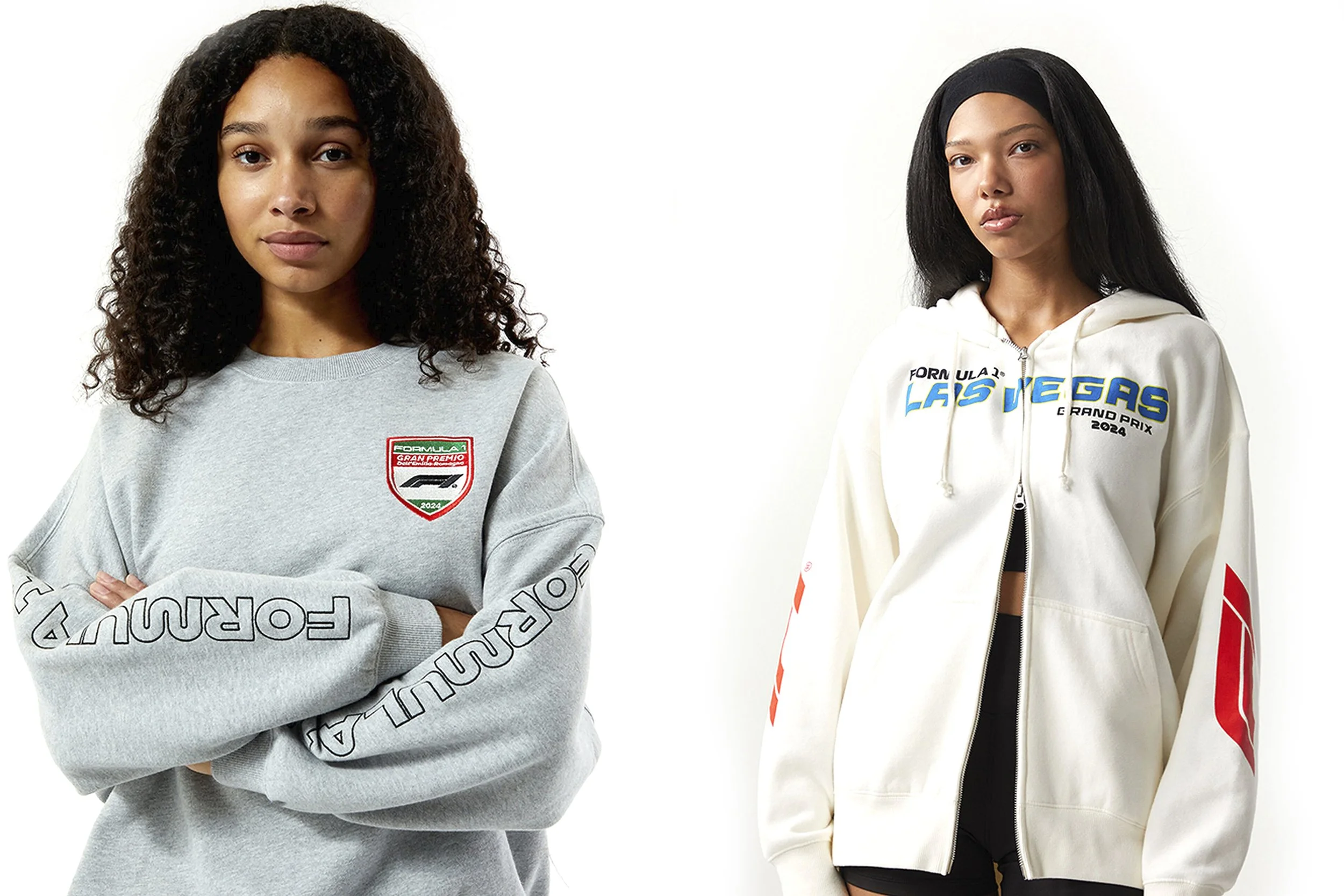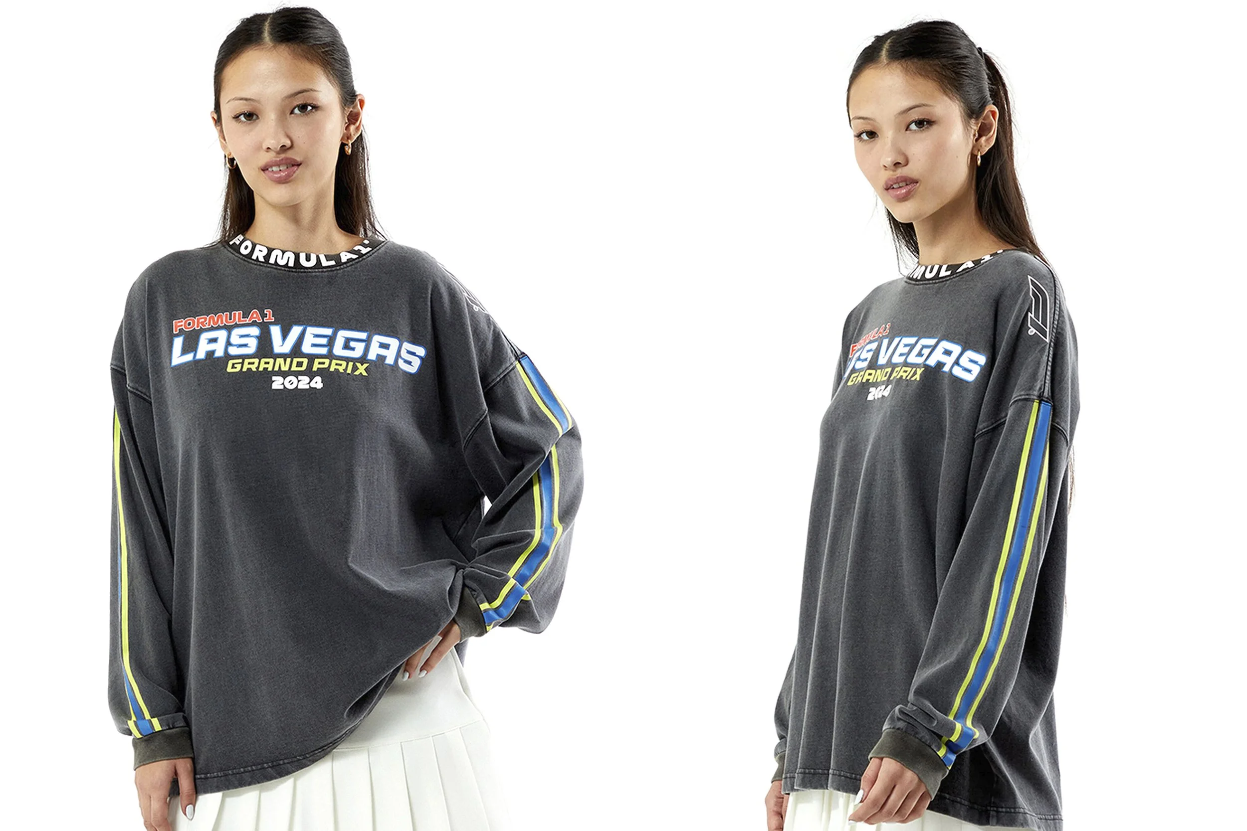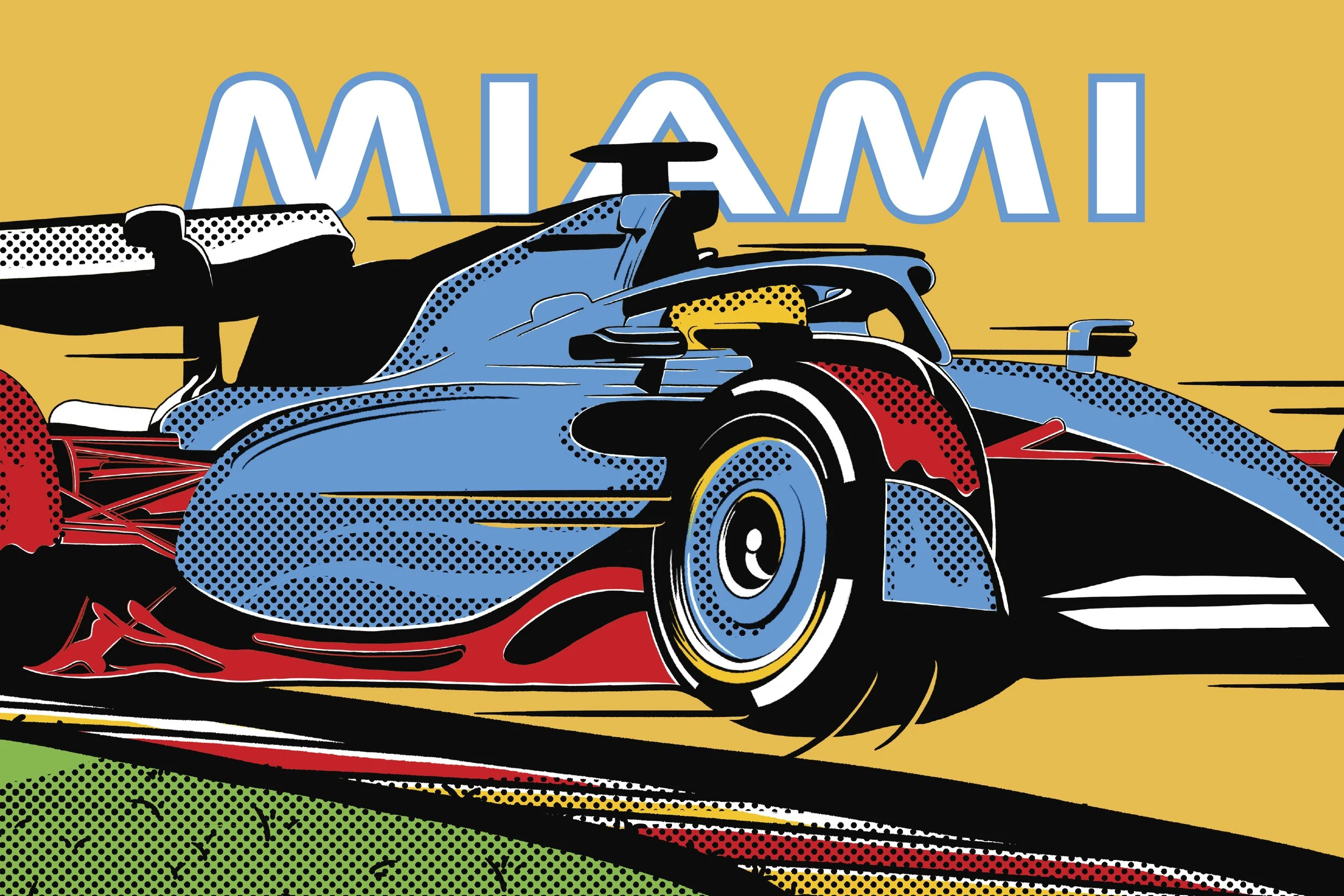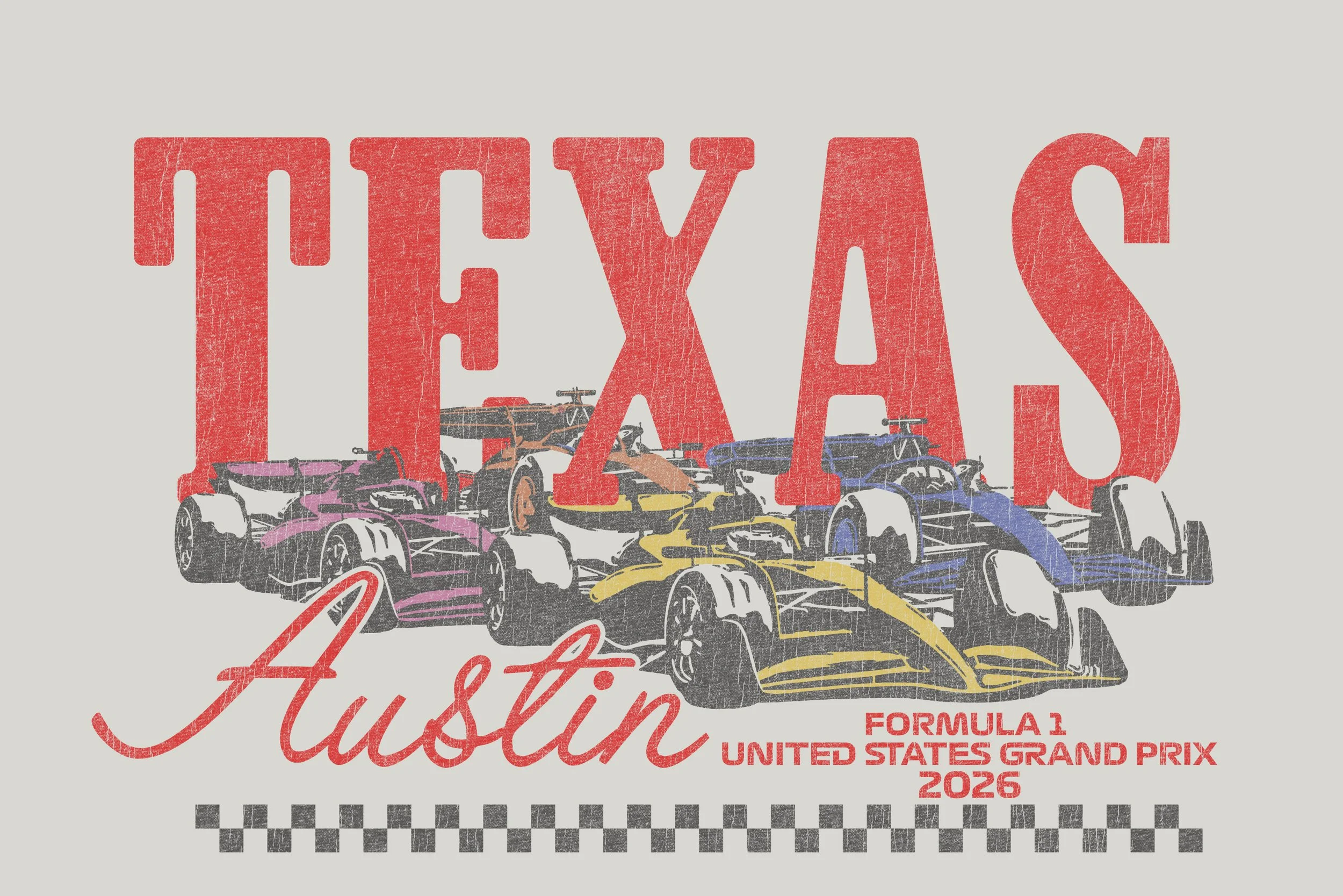
Across Pacsun's ongoing F1 partnership, I developed a distinct graphic direction for each race location: pop-art inspired illustration for Miami, Texas desert Western graphics for Austin, Italian flag-inspired colorblocking for Emilia Romagna, and a neon typographic system for Las Vegas. Each drop built its own visual world while staying cohesive within F1's global brand standards.
The stakes were higher than a standard retail program. Select drops were sold trackside at the Las Vegas and Austin Grand Prix where product competes for attention in one of the most visually saturated environments in sports. Styles sold out at both events.
The target consumer was young women discovering motorsport for the first time work that needed to feel credible to F1 insiders but cool and approachable for someone who cared more about the aesthetic than the lap times. Hitting that balance consistently across multiple seasons, race markets, and silhouettes is what this program represents.