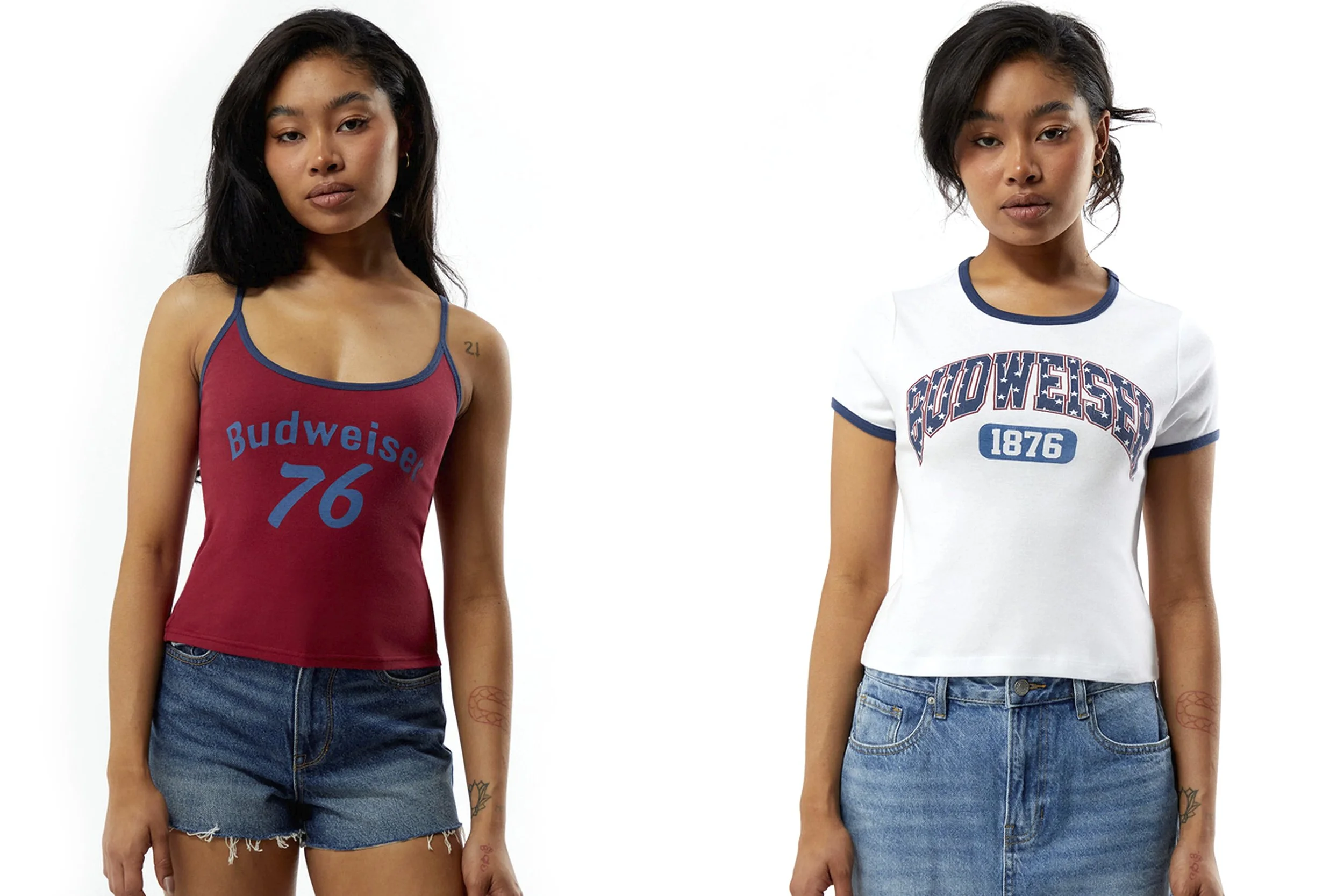
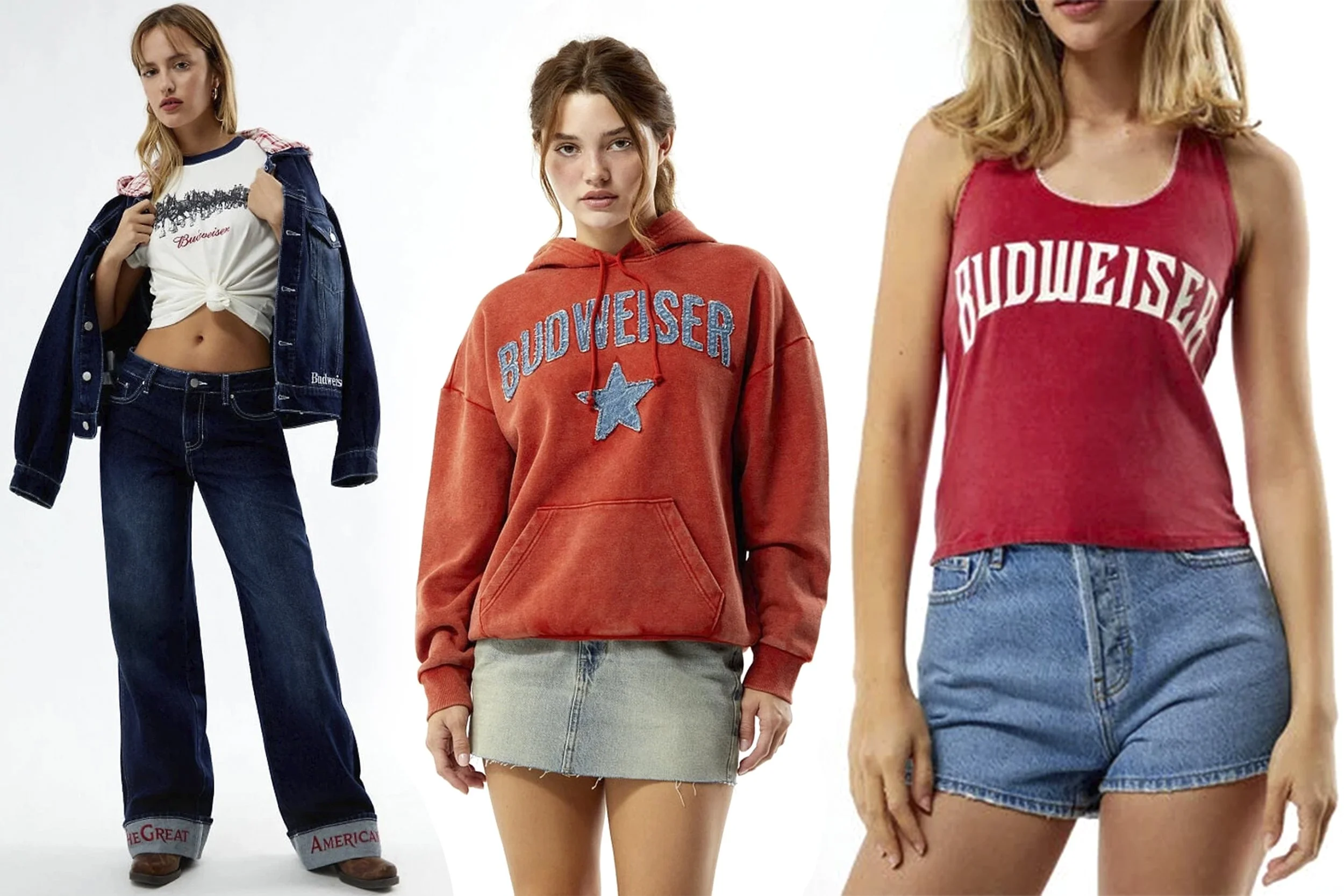
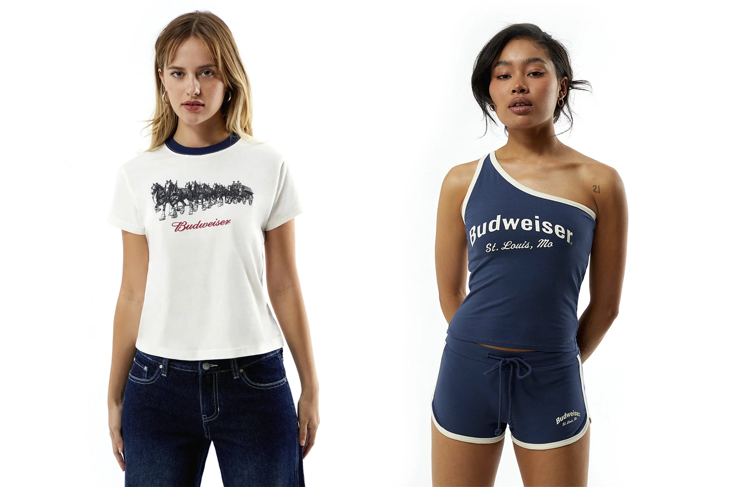
Pacsun's Budweiser collection required building multiple distinct graphic directions simultaneously: vintage Americana collegiate graphics, retro jersey-inspired typography, classic Clydesdale illustrations, and clean logo driven lifestyle pieces each with its own visual language, all cohesive within a single drop. The work spanned ribbed tanks, baby tees, ringer tees, and coordinated sets, translating Budweiser's nostalgic heritage into something a young consumer would actually want to wear.
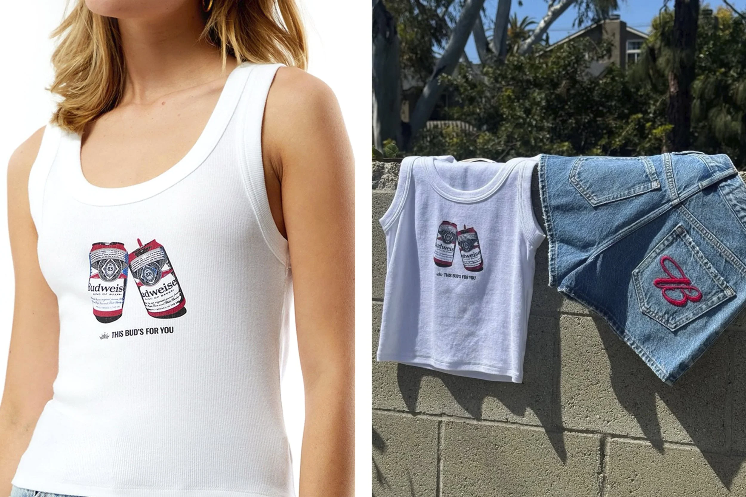
The standout piece started with an iPhone and a pack of beer cans shot on my back patio. I photographed the cans myself, built the graphic from that original image, and it became the number one selling graphic in the program generating multiple reorders across online and retail doors.
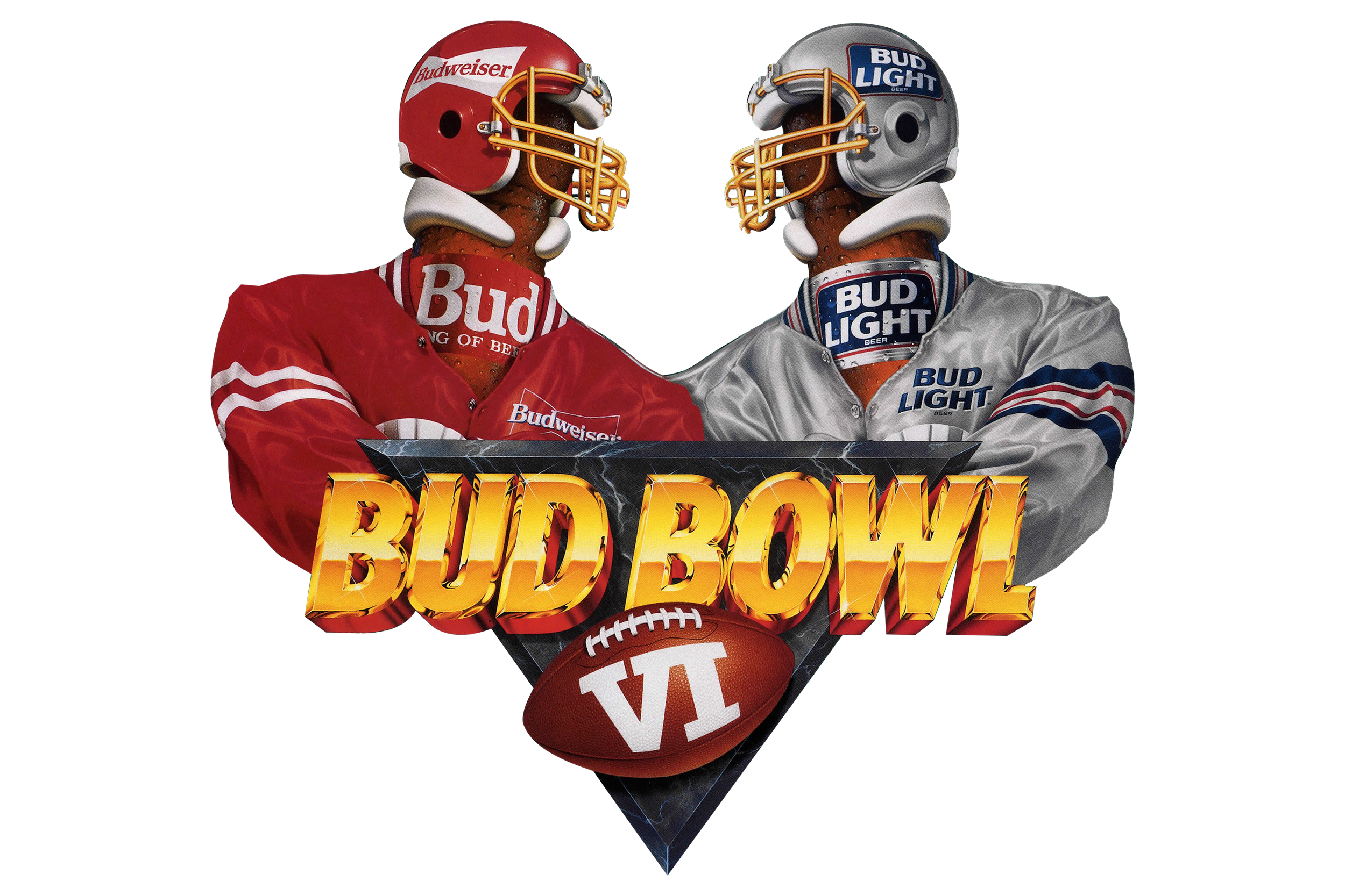
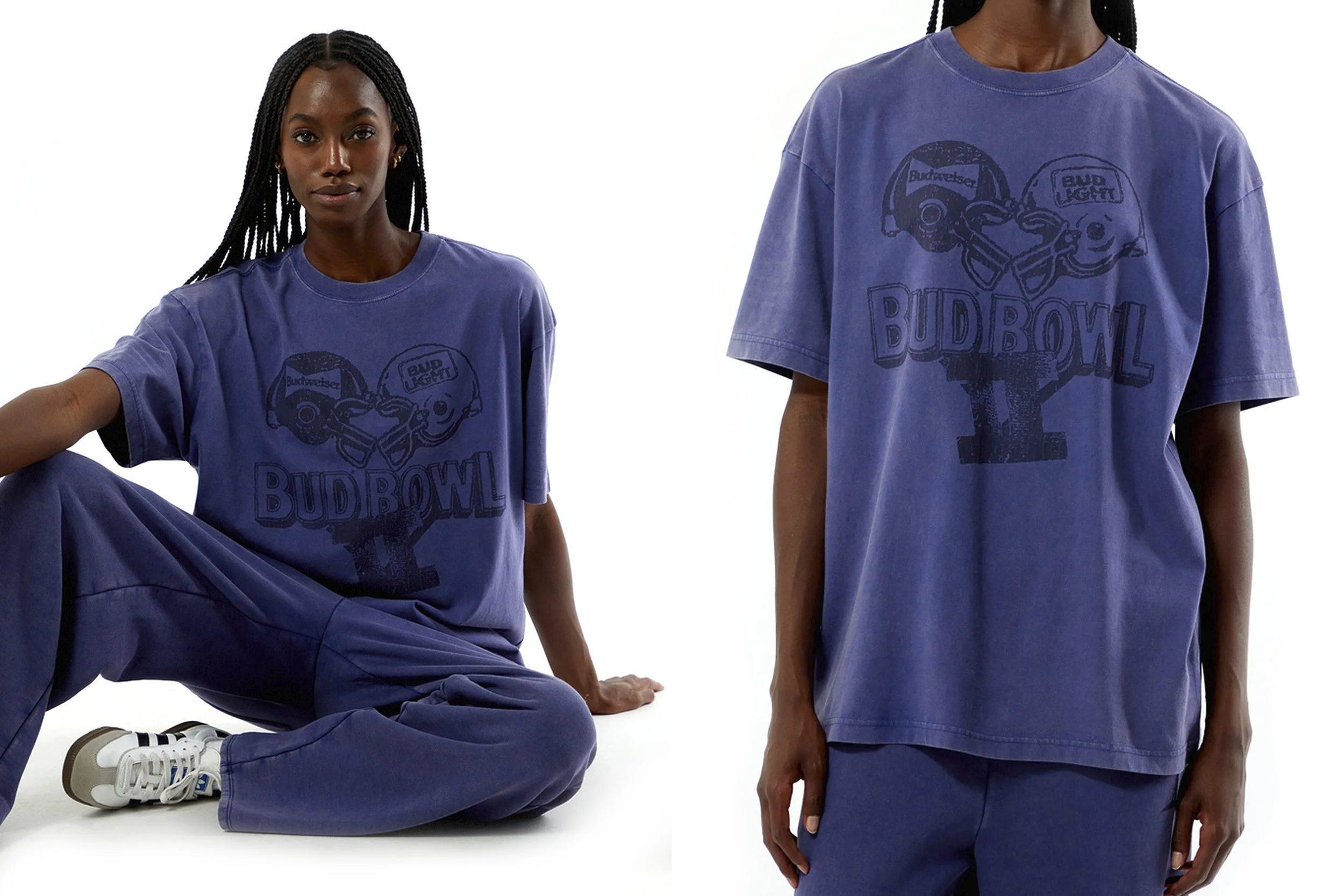
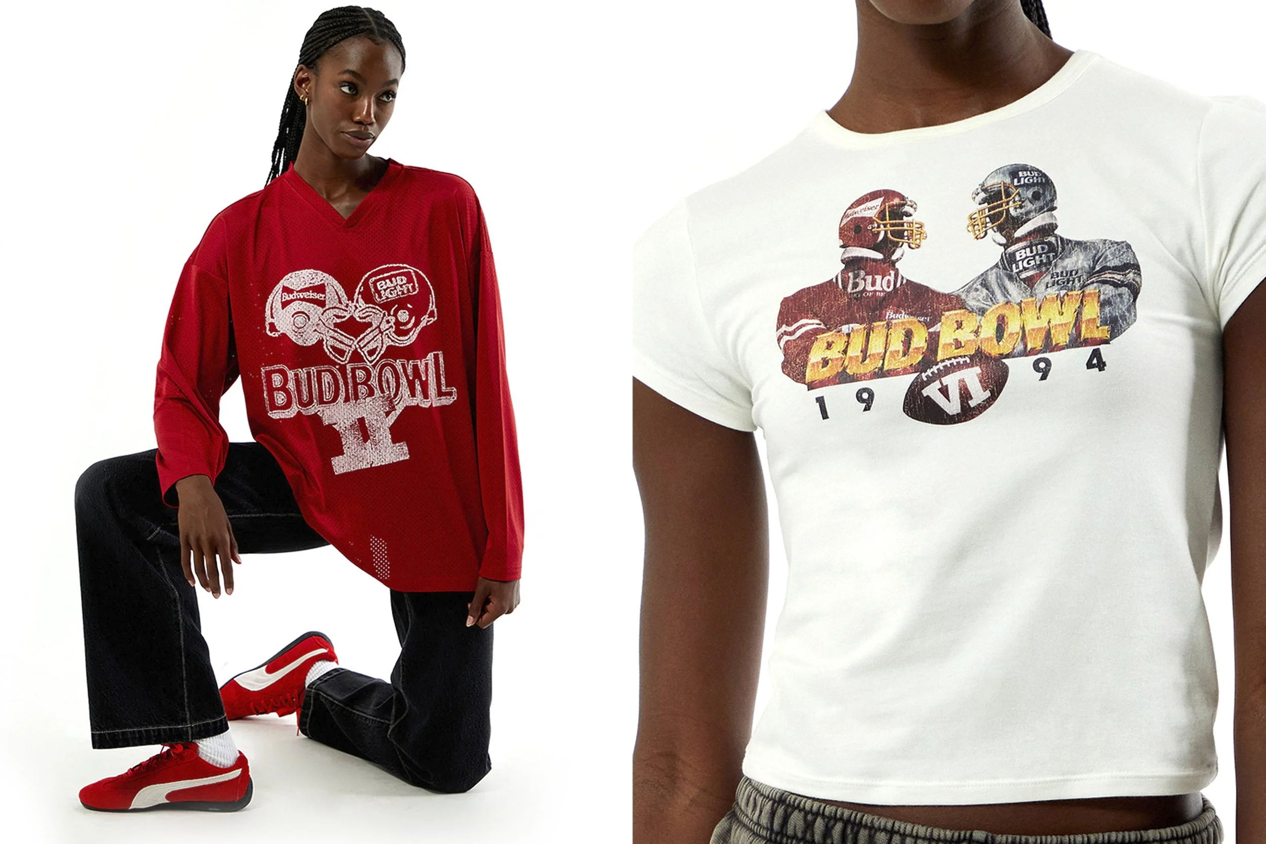
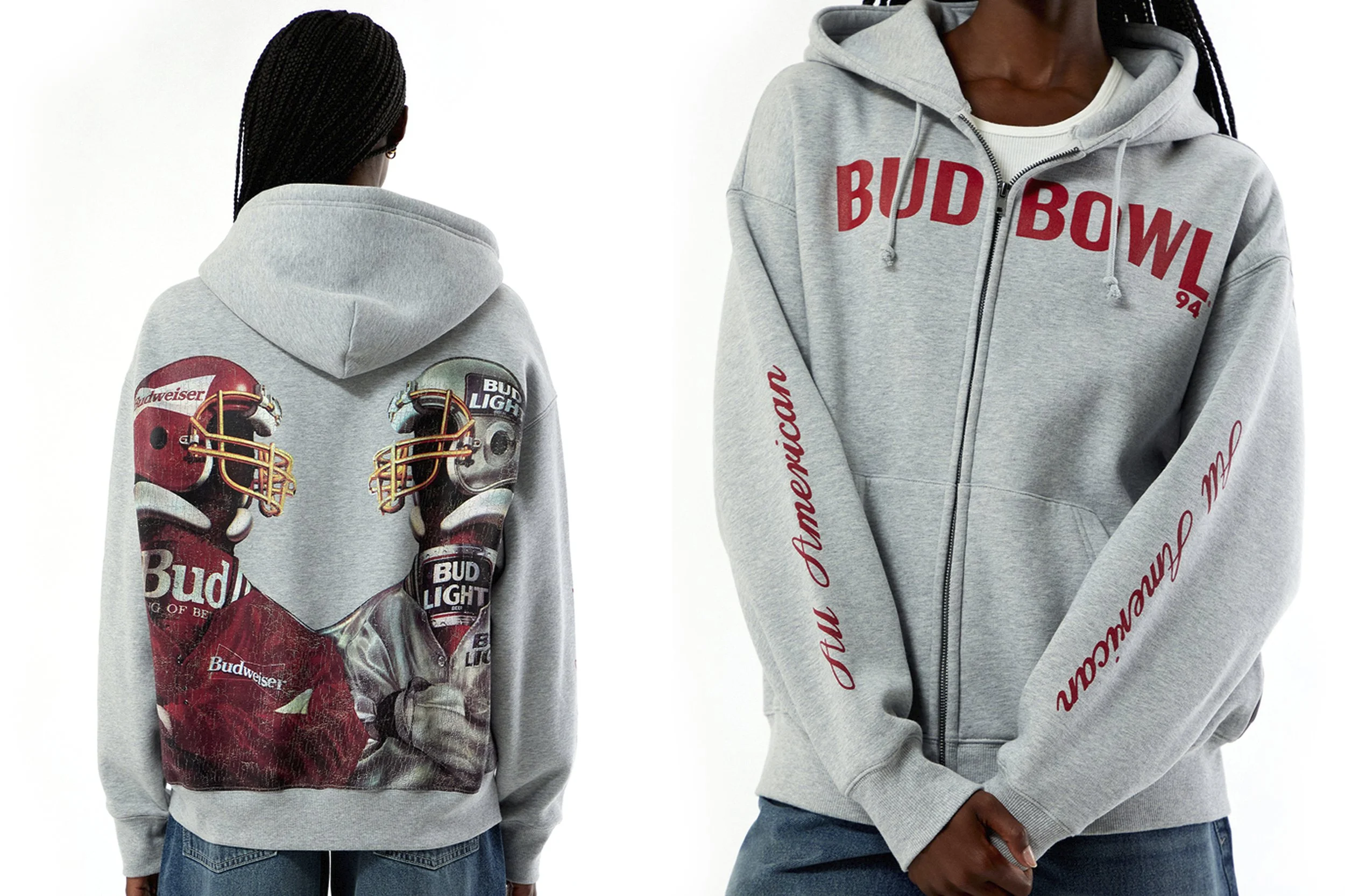
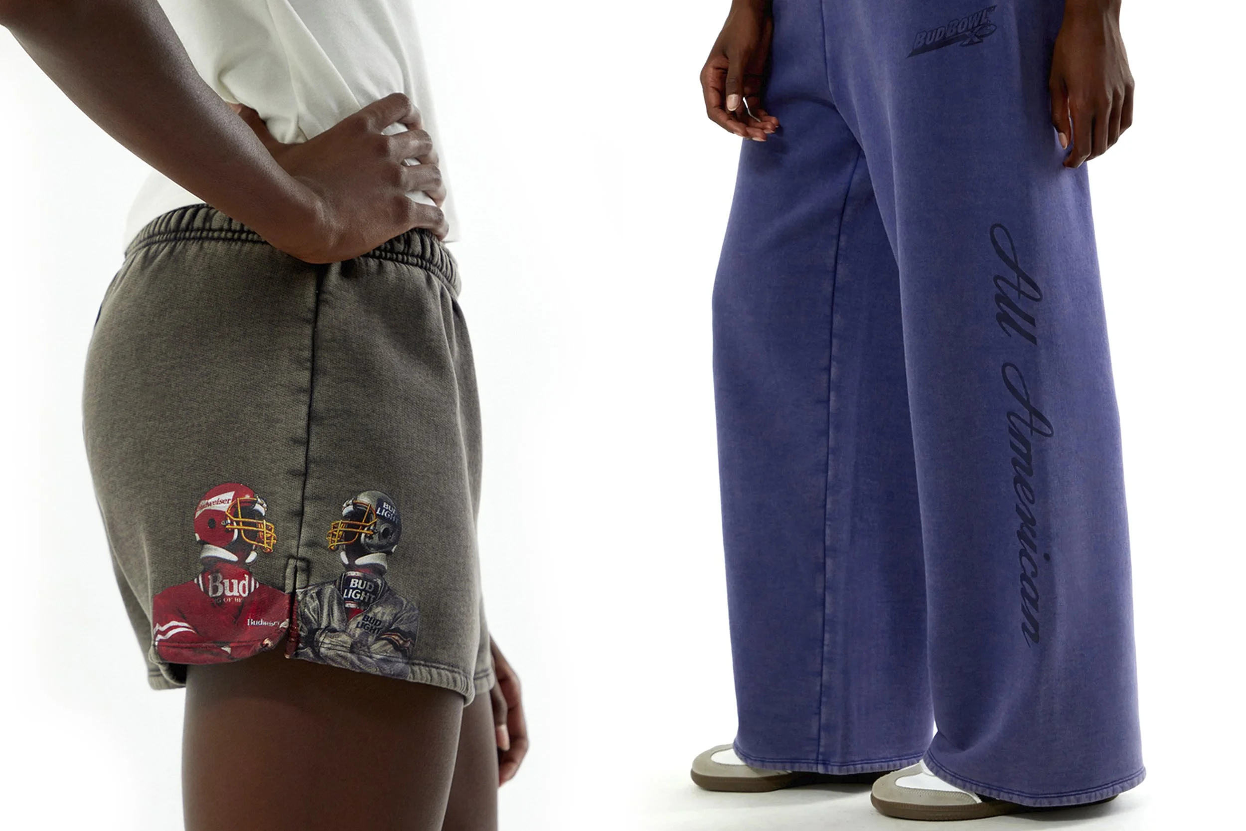
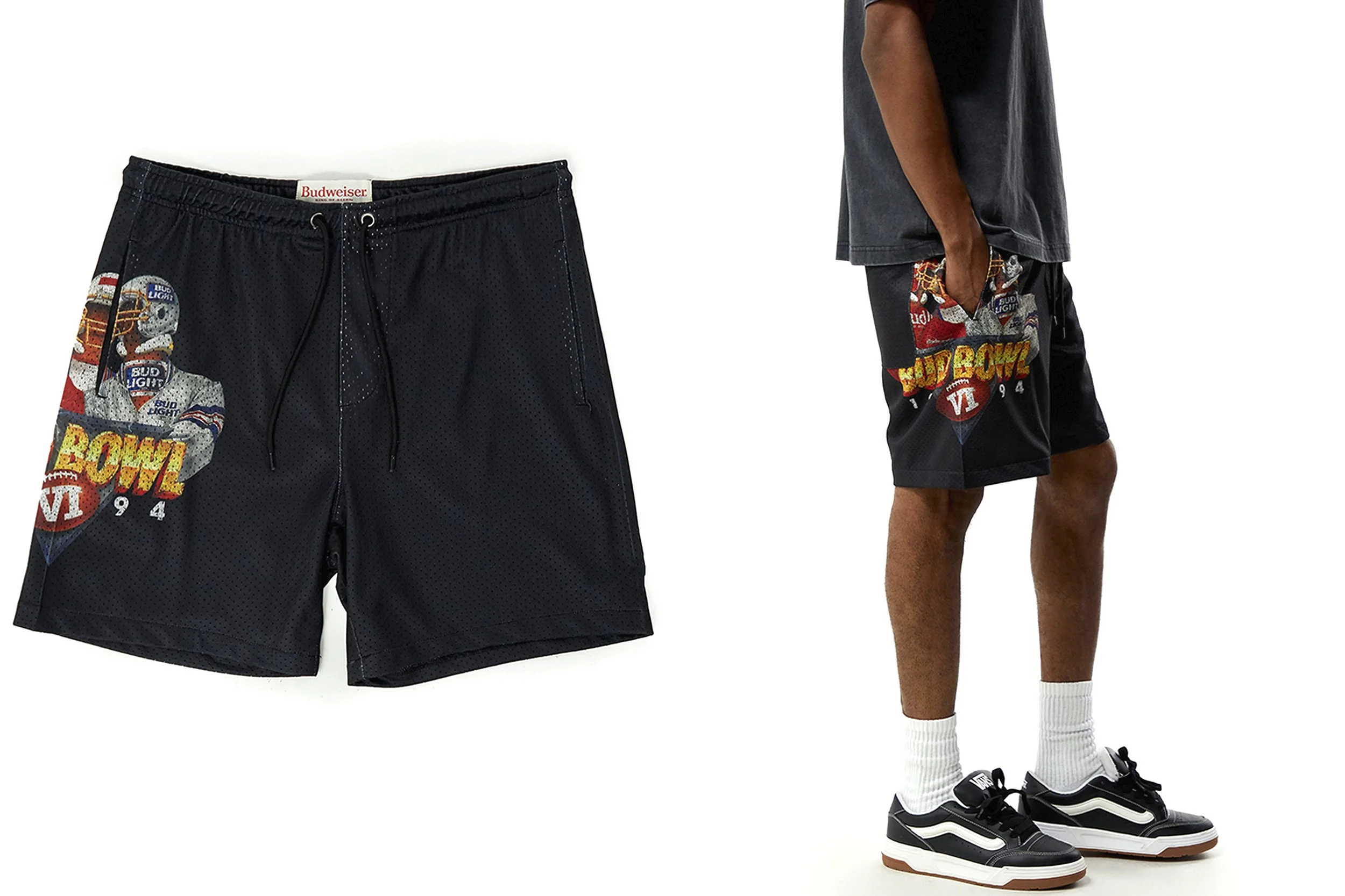
The Bud Bowl capsule came from a different instinct a creative initiative from within the design team to offer something genuinely new to the license rather than a watered-down version of what already existed in a saturated market. Working from only a handful of vintage posters and low-resolution archival materials, I reconstructed the original Bud Bowl campaign graphics, leaning into grain and distress as intentional design choices. The result spanned tonal pigment-dyed treatments, distressed helmet illustrations, and bold all-over back graphics built around the classic Budweiser vs. Bud Light matchup. Select styles and accessories sold out, making it one of the strongest collections in the program.